Containers in the plentyShop LTS template
Approximately 70 containers are available on the different pages and views of the plentyShop LTS template plugin allowing you to replace existing content or display additional content. The content provided by other plugins can be integrated in the following areas of the online store:
-
Header and footer of the page
-
Homepage
-
Other content pages
-
Category view
-
Single item view
-
Shopping cart and shopping cart preview
-
Checkout
-
Order confirmation page
List of containers
Find a list of all containers in the table below:
Template & Scripts
| Container key | Container name | Description |
|---|---|---|
Template.Style |
Style |
Add style to Ceres with a theme plugin |
Template.StyleOverwrite |
Override style |
Override the default CSS file of Ceres |
Script.Loader |
Register/load JS |
Register scripts, events and other JS related items |
Script.AfterScriptsLoaded |
After scripts loaded |
Load scripts, events and other JS related items, e.g. Vue components, after frameworks and scripts have been initialised |
Static pages
| Container key | Container name | Description |
|---|---|---|
StaticPages.CancellationRights |
Cancellation rights |
Add additional content on the cancellation rights page |
StaticPages.CancellationForm |
Cancellation form |
Add additional content on the cancellation form pages |
StaticPages.LegalDisclosure |
Legal disclosure |
Add additional content on the legal disclosure page |
StaticPages.PrivacyPolicy |
Privacy policy |
Add additional content on the privacy policy page |
StaticPages.TermsAndConditions |
Terms and conditions |
Add additional content on the terms and conditions page |
StaticPages.PageNotFound |
Page not found |
Add additional content on the 404 page |
Homepage
| Container key | Container name | Description |
|---|---|---|
Homepage |
Override homepage |
Override the complete homepage |
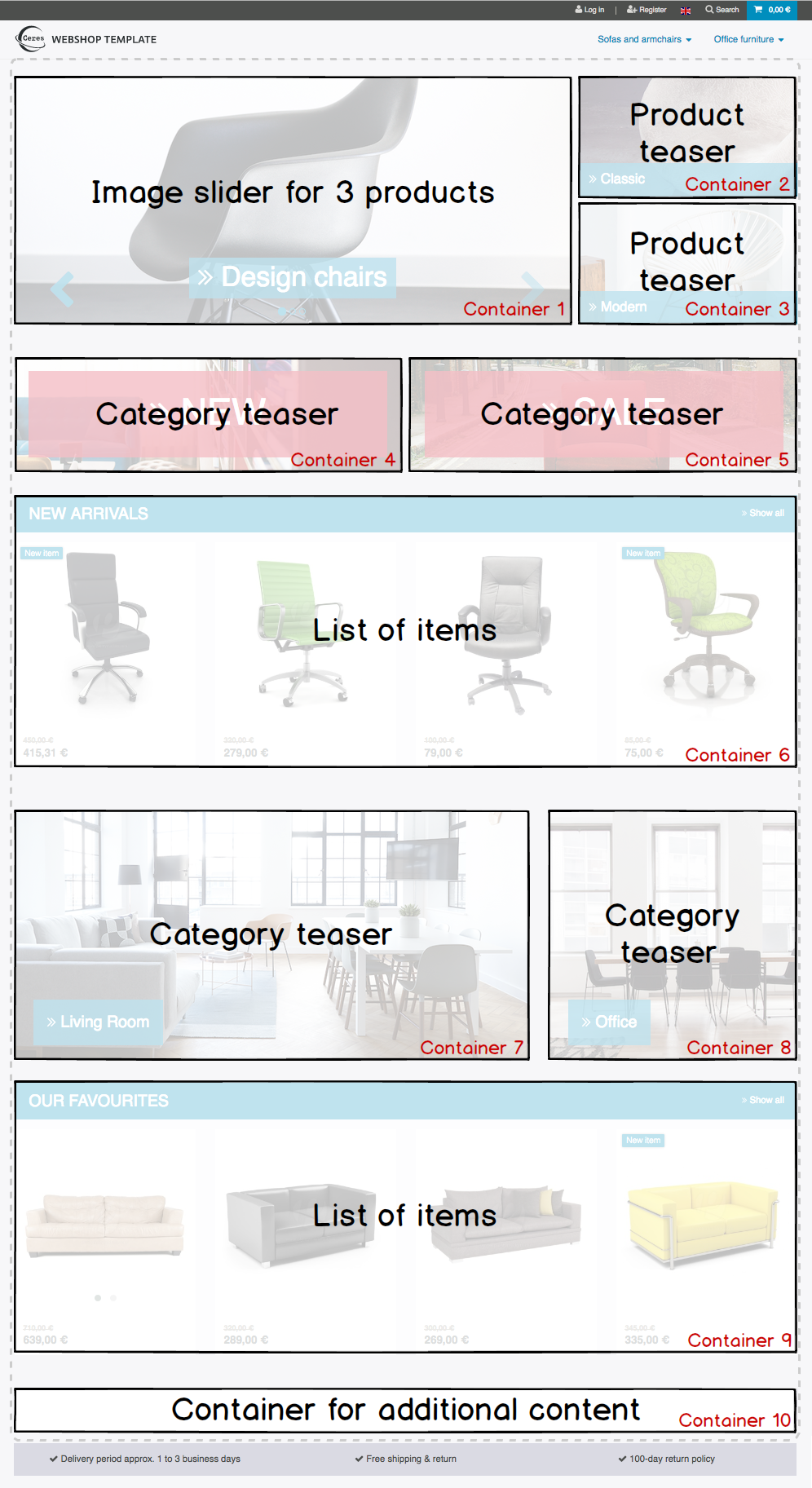
Homepage.Container1 |
Container 1 |
Replace the image slider of the homepage |
Homepage.Container2 |
Container 2 |
Replace the upper item preview of the homepage |
Homepage.Container3 |
Container 3 |
Replace the lower item preview of the homepage |
Homepage.Container4 |
Container 4 |
Replace the first category preview of the homepage |
Homepage.Container5 |
Container 5 |
Replace the second category preview of the homepage |
Homepage.Container6 |
Container 6 |
Replace the first list of items of the homepage |
Homepage.Container7 |
Container 7 |
Replace the third category preview of the homepage |
Homepage.Container8 |
Container 8 |
Replace the fourth category preview of the homepage |
Homepage.Container9 |
Container 9 |
Replace the second list of items of the homepage |
Homepage.Container10 |
Container 10 |
Add additional content on the homepage |
Homepage.PaymentMethods |
Payment method container |
Add a logo of the payment method to the payment methods on the homepage |
Homepage.Shipping |
Shipping method container |
Add a logo of the shipping method to the shipping methods on the homepage |
Homepage.Certified |
Certified container |
Add a Certified by logo to the container on the homepage |
Header of the page
| Container key | Container name | Description |
|---|---|---|
Header.LeftSide |
Left header container |
Add content to the container on the left in the header |
Search.SearchBar |
Search: Override the search bar |
Override the search bar in the header |
Footer of the page
| Container key | Container name | Description |
|---|---|---|
Footer.RowOne |
Row 1 container |
Add content to the first row of the footer |
Footer.RowTwo |
Row 2 container |
Add content to the second row of the footer |
Footer.RowThree |
Row 3 container |
Add content to the third row of the footer |
Single item view
| Container key | Container name | Description |
|---|---|---|
SingleItem.BeforePrice |
Before price |
Add content before the item price in the single item view |
SingleItem.AfterPrice |
After price |
Add content after the item price in the single item view |
SingleItem.BeforeAddToBasket |
Before Add to shopping cart button |
Add content before the Add to shopping cart button in the single item view |
SingleItem.AfterAddToBasket |
After Add to shopping cart button |
Add content after the Add to shopping cart button in the single item view |
SingleItem.AdditionalContentAfterAddToBasket |
Additional content after Add to shopping cart button |
Add additional content after the Add to shopping cart button in the single item view |
SingleItem.AddDetailTabs |
Add detail tabs |
Add additional tabs to the tab menu in the single item view |
SingleItem.AddDetailTabsContent |
Add content to detail tabs |
Add content to the detail tabs in the single item view |
SingleItem.ImageCarousel |
Override image carousel |
Override the image carousel on the single item. |
SingleItem.AfterScriptsLoaded |
Single item: After scripts loaded |
Load scripts, events and other Javascript related items, such as Vue components, after frameworks and scripts have been initialised on the single item view. |
SingleItem.Styles |
Single item: Styles |
Load CSS in the head after all other styles have been loaded. |
SingleItem.ItemListContainer |
Container for item lists |
Add item lists in the single item view |
SingleItem.FeedbackContainer |
Container for customer feedback |
Add item lists in the single item view |
Shopping cart
| Container key | Container name | Description |
|---|---|---|
BasketTotals.BeforeItemSum |
Before Value of items |
Add content before the value of items in the Total column of the shopping cart |
BasketTotals.AfterItemSum |
After Value of items |
Add content after the value of items in the Total column of the shopping cart |
BasketTotals.BeforeShippingCosts |
Before Shipping |
Add content before the shipping costs in the Total column of the shopping cart |
BasketTotals.AfterShippingCosts |
After Shipping |
Add content after the shipping costs in the Total column of the shopping cart |
BasketTotals.BeforeVat |
Before VAT |
Add content before the VAT in the Total column of the shopping cart |
BasketTotals.AfterVat |
After VAT |
Add content after the VAT in the Total column of the shopping cart |
BasketTotals.BeforeTotalSum |
Before Total |
Add content before the total sum in the Total column of the shopping cart |
BasketTotals.AfterTotalSum |
After Total |
Add content before the total sum in the Total column of the shopping cart |
BasketList.BeforeItem |
Shopping cart items list: Before item |
Add content before the item in the item list of the shopping cart |
BasketList.AfterItem |
Shopping cart items list: After item |
Add content after the item in the item list of the shopping cart |
Basket.BeforeCoupon |
Before the Coupon input field |
Add content before the Coupon input field in the shopping cart |
Basket.BeforeCheckoutButton |
Before Checkout button |
Add content before the Checkout button in the shopping cart |
Basket.AfterCheckoutButton |
After Checkout button |
Add content after the Checkout button in the shopping cart |
Shopping cart overlay
| Container key | Container name | Description |
|---|---|---|
Basket.ExtendOverlayButtons |
Extend buttons |
Add additional buttons to the shopping cart overlay. Note that the class |
Shopping cart preview
| Container key | Container name | Description |
|---|---|---|
BasketPreview.BeforeCheckoutButton |
Before Checkout button |
Add content before the Checkout button in the shopping cart preview |
BasketPreview.AfterCheckoutButton |
After Checkout button |
Add content after the Checkout button in the shopping cart preview |
Checkout
| Container key | Container name | Description |
|---|---|---|
Checkout |
Override checkout |
Override the complete checkout page |
Checkout.AddressLists |
Override address controls |
Override the invoice and delivery address controls in the checkout |
Checkout.BillingAddress |
Override invoice address control |
Override the invoice address control in the checkout |
Checkout.BeforeBillingAddress |
Before invoice address |
Add content before the invoice address control in the checkout |
Checkout.AfterBillingAddress |
After invoice address |
Add content after the invoice address control in the checkout |
Checkout.ShippingAddress |
Override shipping address control |
Override the shipping address control in the checkout |
Checkout.BeforeShippingAddress |
Before shipping address |
Add content before the shipping address control in the checkout |
Checkout.AfterShippingAddress |
After shipping address |
Add content after the shipping address control in the checkout |
Checkout.ShippingProfileList |
Override shipping method |
Override the list of shipping methods in the checkout |
Checkout.BeforeShippingProfileList |
Before shipping method |
Add content before the list of shipping methods in the checkout |
Checkout.AfterShippingProfileList |
After shipping method |
Add content after the list of shipping methods in the checkout |
Checkout.PaymentList |
Override payment method |
Override the list of payment methods in the checkout |
Checkout.BeforePaymentList |
Before payment method |
Add content before the list of payment methods in the checkout |
Checkout.AfterPaymentList |
After payment method |
Add content after the list of payment methods in the checkout |
Checkout.OptIns |
Opt-ins |
Add content to opt-in checkboxes in the checkout |
Checkout.BeforeBasketTotals |
Before basket totals |
Add content before the basket totals in the checkout |
Checkout.AfterBasketTotals |
After basket totals |
Add content after the basket totals in the checkout |
Checkout.PlaceOrder |
Override Order now button |
Override the Order now button in the checkout |
Checkout.BeforePlaceOrder |
Before Order now button |
Add content before the Order now button in the checkout |
Checkout.AfterPlaceOrder |
After Order now button |
Add content after the Order now button in the checkout |
Checkout.CustomAddressField |
Address field container |
Add content, e.g. one or multiple custom address fields, at the bottom of the address form |
Checkout.AfterScriptsLoaded |
Checkout: After scripts loaded |
Load scripts, events and other Javascript related items, such as Vue components, after frameworks and scripts have been initialised in the checkout. |
Checkout.Styles |
Checkout: Styles |
Load CSS in the head after all other styles have been loaded. |
Order confirmation page
| Container key | Container name | Description |
|---|---|---|
OrderConfirmation.Override |
Override order confirmation |
Override the complete order confirmation page |
OrderConfirmation.BeforeOrderDetails |
Before order details |
Add content before the order details on the order confirmation page |
OrderConfirmation.AdditionalShippingInformation |
Additional shipping information |
Add additional shipping information to the order details on the order confirmation page |
OrderConfirmation.AdditionalPaymentInformation |
Additional payment information |
Add additional payment information on the order confirmation page |
OrderConfirmation.GrossNetReplace |
Override gross/net prices |
Override the gross/net prices on the order confirmation page |
OrderConfirmation.AfterTotals |
Add content after totals |
Add content after totals on the order confirmation page |
OrderConfirmation.AddContentAfterOrderDetailsRow |
Add content before 'Back to Homepage' link |
Add content before the 'Back to Homepage' link on the order confirmation page |
My account page
| Container key | Container name | Description |
|---|---|---|
MyAccount.OrderHistoryPaymentInformation |
Additional payment information |
Add additional payment information after the order information on the My account page |
Category item list
| Container key | Container name | Description |
|---|---|---|
CategoryItem.BeforePrices |
Before prices container |
Add content before the prices in the category item view |
CategoryItem.AfterPrices |
After prices container |
Add content after the prices in the category item view |
CategoryItem.SideNavBarBottom |
Container below side navigation |
Add content below the side navigation bar in the category item view |
Login
| Container key | Container name | Description |
|---|---|---|
Login.AdditionalContentAfterButtons |
Container below the buttons |
Add content below the buttons in the login view. Note that the class |
LoginOverlay.ExtendOverlayButtons |
Container in a row with the buttons |
Add content in the login overlay. Note that the class |
Containers on the homepage
The plentyShop LTS homepage provides multiple containers which can be used to replace the content of the default homepage or add more content to the homepage. Find an overview of the homepage containers below:
Using containers in the template
Following the tutorial above, we have learned about the plugin providing the data for our template. Now, you will learn how to use containers in template plugins.
Container entry point
The entry point of a container is defined in the plugin.json file of a plugin.
"containers"        :
    [
        {
            "key"           : "Homepage.Certified",
            "name"          : "Homepage: Certified container",
            "description"   : "Add an icon to the certified by container on the homepage",
            "multiple"      : false
        }
]|
Explanation
The
|
Container macro
The content to be displayed in a container is processed by the show() function in a macro. This macro is stored in the LayoutContainer.twig file. With the help of this macro, you can also access objects in layout containers, e.g. the item object in the SingleItemView.twig template.
{% macro show( containerName, object ) %}
    {% if object == null %}
        {% for content in container(containerName) %}
            {{ content.result|raw }}
        {% endfor %}
    {% else %}
        {% for content in container(containerName, object) %}
            {{ content.result|raw }}
        {% endfor %}
    {% endif %}
{% endmacro %}
Container in the template
Our Certified by container is integrated into the template of plentyShop LTS using the following code.
{% import "Ceres::PageDesign.Macros.LayoutContainer" as LayoutContainer %}

...

{% set certifiedContent = LayoutContainer.show("Ceres::Homepage.Certified") %}
{% if certifiedContent|trim is not empty %}
    <div class="services-certificate m-b-1">
        <strong class="services-title">{{ trans("Ceres::Template.generalCertifiedBy") }}</strong>
        {{ certifiedContent }}
    </div>
{% endif %}|
Explanation
A Twig function sets the variable The title of the container is displayed using the The |
Objects in containers
By using the LayoutContainer.twig macro, we can access objects in layout containers. We specify the object as a parameter in the container and can make use of all the information of the current object.
{{ LayoutContainer.show("Ceres::SingleItem.BeforePrice", item.documents[0].data) }}
{% if ('item.recommendedPrice' in itemData or 'all' in itemData) %}
    <div class="crossprice" v-resource-if:currentVariation="documents[0].data.calculatedPrices.rrp.price > 0">
        <del class="text-muted small" v-resource-bind:currentVariation="documents.0.data.calculatedPrices.rrp.price" :filters="['currency']">
            {#{{ item.data.salesPrices[1].price | formatMonetary(item.variationRetailPrice.currency) }} TODO get correct currency#}
            {{ item.documents[0].data.calculatedPrices.rrp.price | formatMonetary(item.documents[0].data.calculatedPrices.rrp.currency) }}
        </del>
    </div>
{% endif %}|
Explanation
Here, we specify the In addition to the |
{{ LayoutContainer.show("Ceres::OrderConfirmation.AdditionalPaymentInformation", services.customer.getLatestOrder().order) }}Here, we specify the order object as the second parameter of our layout container. This allows us to use the information about the latest order saved in the object for further processing.
Additional tabs in the single item view
In order to add your own information in an additional tab in the single item view, you can use two containers. The first container SingleItem.AddDetailTabs is used for displaying one or multiple additional tabs in the view of an item in the plentyShop LTS online store. The second container SingleItem.AddDetailTabsContent displays your content within the first container. For each container, an individual data provider is required.
<li class="nav-item">
    <a class="nav-link" data-toggle="tab" href="#my-custom-tab" role="tab">Custom Tab</a>
</li>
Our tab is a li element with the class nav-item. If more tabs are required, further list items can be added here. In the href attribute, we provide a link to our tab content.
<div class="tab-pane" id="my-custom-tab" role="tabpanel">
    <div class="m-y-2">
        Enter Custom Tab content here...
    </div>
</div>
In a second Twig file, we enter the content for our tab. Our container has the same ID, that is referenced in the previous code example, e.g. id="my-custom-tab".