How to build ShopBuilder widgets
This tutorial will show you how to build a plugin that provides a widget for the PlentyONE ShopBuilder. In the case of this tutorial, the widget will implement Google Maps in the ShopBuilder. The Google Maps widget described here is version 1.0.0.
You can download the Google Maps widget from GitHub:
Tutorial contents:
Widget plugin folder structure
MyWidget/
    ├── resources/
    │   ├── images/
    │   │   └── MyWidget.svg // Preview image of the widget
    │   │
    │   ├── lang/
    │   │   └── de/en
    │   │       └── MyWidget.properties // Contains the widget texts, such as labels and tooltips
    │   │
    │   └── views/
    │       └── Widgets/
    │           └── MyWidget.twig // Content to be injected into the ShopBuilder template container
    ├── src/
    │   ├── Widgets/
    │   │   └── MyWidget.php // The widget's PHP class
    │   │
    │   └── Providers/
    │       └── MyWidgetServiceProvider.php
    │
    ├── plugin.json // Contains the plugin information
    │
    └── contentWidgets.json // Contains the widget information
Description of the contentWidgets.json
The contentWidgets.json file serves to make a widget available to the ShopBuilder. The contentWidgets.json file holds all information that is necessary in order to configure the widget in the ShopBuilder interface, including its icon and settings. The same plugin can provide multiple widgets as objects in the contentWidgets.json array. The contentWidgets.json file needs to be located in the root directory of the plugin, i.e. on the same level as the plugin.json.
Below you find the content of the contentWidgets.json and the table explaining the individual key-value pairs listed in the JSON file.
[
    {
        "identifier": "GoogleMapsWidget::MapsWidget",
        "label": "Widget.mapsLabel",
        "previewImageURL": "/images/google-maps-widget.svg",
        "type": "static",
        "categories": [],
        "position": 1050,
        "widgetClass": "GoogleMapsWidget\\Widgets\\MapsWidget",
        "settings": {
            "apiKey": {
                "type": "text",
                "required": true,
                "defaultValue": "",
                "options": {
                    "name": "Widget.mapsApiKeyLabel",
                    "tooltip": "Widget.mapsApiKeyTooltip"
                }
            },
            "address": {
                "type": "textarea",
                "required": true,
                "defaultValue": "",
                "options": {
                    "name": "Widget.mapsAddressLabel",
                    "tooltip": "Widget.mapsAddressTooltip"
                }
            },
            "zoom": {
                "type": "number",
                "required": false,
                "defaultValue": 16,
                "options": {
                    "name": "Widget.mapsZoomLabel",
                    "tooltip": "Widget.mapsZoomTooltip"
                }
            }
        }
    }
]
identifier
The unique identifier of the widget. It is sensible for this identifier to include the namespace of the plugin.
label
Contains the label of the widget that is used to display the widget’s name in the ShopBuilder user interface. The label provided here refers to the translation key stored in the widgets.properties files under \resources\lang\de and \resources\lang\en.
previewImageURL
Contains the icon that is displayed in the widget list of the ShopBuilder interface. The path provided here refers to an image stored under \resources\images. The usual image formats are applicable (SVG, JPG, PNG), but we recommend that you use an image in SVG format with a width of 350px and a height of 120px. The icon can also be provided via a URL.
type
There are four types of widgets: static, structure, header and footer. The widget type determines where the widget can be implemented on a page. Widgets of the type header can only be integrated into the header section of a ShopBuilder page; widgets of the types default and structure can be integrated into the body and footer sections of a ShopBuilder page; widgets of the type footer can only be integrated into the footer section of a ShopBuilder page. The widget type is also relevant for the allowedNestingTypes detailed below.
categories
Contains the categories of the widget as an array. The categories specified here define where the widget is grouped in the widget overview in the ShopBuilder editor. plentyShop LTS provides 6 default categories (header, footer, structure, image, text, item), but you can specify further categories in the shopBuilder.json. Here, the category is left empty; as a result, the widget will be listed under "more widgets".
position
Contains the position of the widget in the widget list of the ShopBuilder user interface. The positions of widgets provided by plentyShop LTS are numbered in steps of 100. Setting the position of a widget to 150, for instance, places it in the second position of the widget list between two plentyShop LTS widgets.
widgetClass
This is the path of the widget’s PHP class. In our case, the class' label is MapsWidget and is located at src/Widgets/MapsWidget. In the widget’s class, you define the location of the TWIG template and determine which data is handed over to the TIWG template.
settings
The settings provide the configuration options of the widget in the ShopBuilder. The settings are stored in a JSON object. Each item in the settings object needs to have a unique key, which is used in the code to refer to it. In the case of the Google Maps widget, the three setting keys are apiKey, address and zoom. You can provide as many settings as necessary for your widget.
-
type: Specifies the input type of the widget setting. Please find a detailed explanation of the various input types Widget input types.
-
required: A Boolean that determines whether this widget setting is mandatory for the user.
-
defaultValue: Determines the default value for a setting. The type of value is contingent on the input type. Please find a detailed description of applicable default values for each input type further below.
-
options: The options are a JSON object that includes the name of the setting and the tooltip. If the setting’s input type is a select, i.e. a drop-down list, the options also include the listBoxValues, meaning the various entries in the drop-down list.
-
name: The key for the setting’s name. The key is used to display the text stored in the widgets.properties file.
-
tooltip: The key which is used to display a tooltip when hovering above the setting. The text is stored in the widgets.properties file.
-
-
isVisible: Determines whether the setting is visible. If nothing else is specified, the default value is "true". You can define a JavaScript expression, like an if-condition, that dynamically changes the value of isVisible. An example of how this setting is implemented is described further below.
-
isList: Determines whether the setting can be duplicated. This setting can be used, for instance, to add further slides to the image carousel or add additional entries to the list widget. Please find a detailed explanation of how to implement this setting further below.
Input types
You specify the input type in the settings section of the contentWidgets.json. The following table details the different input types that are available for widget developers.
| Input type | Explanation |
|---|---|
text |
Provides a one-line text input field into which users can enter any combination of letters and numbers. This input type is used for the title bar and list widgets, for example. |
textarea |
Provides a larger text input field in which users can enter any combination of letters and numbers. This text field is not limited to one line. |
number |
Provides an input field that only registers numbers. Users can also enter decimal numbers and negative numbers. |
date |
Provides an input field for dates. The format of the entered date can be MM.DD.YYYY, MM-DD-YYYY or YYYY-MM-DD. |
noteEditor |
Provides a text editor. This input type is similar to the textarea input, but also includes basic markup options, such as bold, italic and lists. |
codeEditor |
Provides a code editor in which users can enter HTML. This input type is used for the text widget, for example. |
checkbox |
Provides a checkbox. Activating the checkbox sets the value to true; deactivating the checkbox sets the value to false. It’s magic. |
file |
Provides a file picker. Clicking the Select file button gives the user access to files stored in the PlentyONE webspace. The file picker is, for instance, used for the ShopBuilder image box and image carousel. |
category |
Provides a category picker via which users can select a category from their pool of item and content categories. |
select |
Provides a drop-down list. If this input type is used for the widgets, the different entries of the drop-down list have to be specified in the options section of the settings. There, the JSON file needs to include listBoxValues underneath name and tooltip, which provides an array with objects that include the keys value, caption and position. The value key specifies the label that is used in the code; the caption retrieves the translation entry from the widgets.properties file and provides the label users see in the ShopBuilder interface; the position determines the order of entries in the drop-down list. If no position is specified for the entries of the drop-down list, the entries are displayed according to their order in the JSON file. |
horizontal |
Provides a horizontal container that allows the display of multiple input fields next to one another. It is used to group multiple settings under one headline. The grouped entries are displayed in the same line and are thereby identifiable as belonging together. It is advised that no more than two settings should be displayed next to each other, since a larger number of entries might negatively impact the layout. The horizontal container is most often used for settings that are expandable by the user via the isList property. The use of the horizontal container necessitates an additional JSON object on the level of the input type, namely the children object. This children object includes the settings you want to group within the container. See the implementation of the isList property below for an illustration of how to use containers. |
vertical |
Provides a vertical container that allows the display of multiple input fields above one another. It is used to group multiple settings under one headline. The grouped entries are indented and are thereby identifiable as belonging together. The vertical container is most often used for settings that are expandable by the user via the isList property. The use of the vertical container necessitates an additional JSON object on the level of the input type, namely the children object. This children object includes the settings you want to group within the container. See the implementation of the the isList property below for an illustration of how to use containers. |
The isVisible property
In the settings of a widget, you can define the property isVisible. By default, the Boolean value of this property is true, so that the setting is always visible. You can, however, specify a JavaScript expression that makes the setting visible if certain conditions are met. Take a look at an excerpt from the item list widget of the ShopBuilder:
"headlineStyle": {
            "type": "select",
            "required": true,
            "defaultValue": "default-caption",
            "options": {
                "name": "Widget.itemListCaptionLabel",
                "tooltip": "Widget.itemListCaptionTooltip",
                "listBoxValues": [
                    {
                        "value": "default-caption",
                        "caption": "Widget.itemListCaptionDefault",
                        "position": 0
                    },
                    {
                        "value": "custom-caption",
                        "caption": "Widget.itemListCaptionCustom",
                        "position": 1
                    },
                    {
                        "value": "no-caption",
                        "caption": "Widget.itemListCaptionNoCaption",
                        "position": 2
                    }
                ]
            }
        },
"headline": {
            "type": "text",
            "required": false,
            "isVisible": "headlineStyle === 'custom-caption'",
            "defaultValue": "",
            "options": {
                "name": "Widget.itemListHeadlineLabel",
                "tooltip": "Widget.itemListHeadlineTooltip"
            }
},|
Explanation
Via the Headline style setting, users can choose whether they want to use the default headline, a custom headline or no headline for the item list. The following setting headline has a specified isVisible property: Therefore, the isVisible property of the headline setting is only true if the option custom-caption has been selected by the user. As a result, the headline setting becomes visible and users can enter custom text for the headline of the item list. If users select the default headline or no headline for the item list, the text input field for the headline is not displayed. |
The isList property
In the settings of a widget, you can define the property isList. This property allows users to add additional entries of the setting to the interface, e.g. additional list entries for the list widget or additional slides for the image carousel. If the isList property is active, the interface automatically displays add and delete buttons.
You can specify a minimum and maximum number of entries, e.g. "isList": "[1, 3]",. The add and delete buttons are greyed out if the specified minimum/maximum number of entries is reached. If you do not specify a minimum/maximum number of entries and instead set the isList value to true, no entry will initially be displayed in the ShopBuilder interface; there will, however, still be an add button for adding entries.
Take a look at an excerpt from the list widget of the ShopBuilder:
"texts": {
        "type": "text",
        "required": false,
        "defaultValue": "",
        "isList": "[1,]",
        "options": {
            "name": "Widget.listTextLabel",
            "tooltip": "Widget.listTextTooltip"
        }
    }
Here, this simple isList property of the texts setting provides the user with the possibility of adding further text input fields, as shown in the following screenshot:
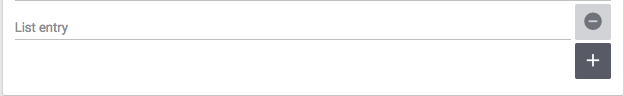
Since no maximum number of entries has been specified, a user can add any number of additional list entries.
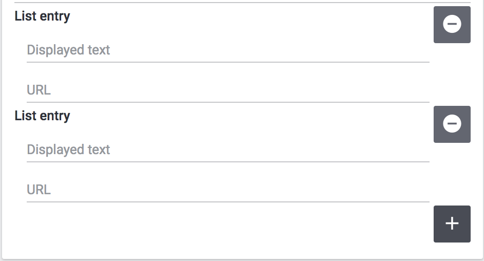
You can also use the isList property to add more complex entries, which consist of more than one setting. To do so, you need to include a children JSON object on the level of the isList property. This children object includes the settings you want users to duplicate. We use this functionality of the isList property for the link list widget of the ShopBuilder:
  "entries": {
                "type": "vertical",
                "isList": "[1,]",
                "options": {
                    "name": "Widget.linkListEntryLabel"
                },
                "children": {
                    "text": {
                        "type": "text",
                        "required": false,
                        "options": {
                            "name": "Widget.linkListEntryNameLabel",
                            "tooltip": "Widget.linkListEntryNameTooltip"
                        }
                    },
                    "url": {
                        "type": "text",
                        "required": false,
                        "options": {
                            "name": "Widget.linkListEntryUrlLabel",
                            "tooltip": "Widget.linkListEntryUrlTooltip"
                        }
                    }
}|
Explanation
The children object includes an input field for text and one for the URL. Both settings are duplicated when the user clicks the add button. The |
The following screenshot illustrates what this looks like in the ShopBuilder interface:
Default values for input types
The following table specifies which default values can be set for each input type. The defaultValue key is part of the settings of a widget and is located at the same level as type, required and options.
| Input type | Possible default value |
|---|---|
text |
Any string is valid. |
textarea |
Any string is valid. |
checkbox |
Boolean |
date |
Any string that is formatted as MM.DD.YYYY, MM-DD-YYYY or YYYY-MM-DD. |
file |
Default value is not applicable. |
category |
Default value is not applicable. |
number |
Integer or float. |
select |
The default value is one of the values specified in the listBoxValues of the drop-down list. |
Widget PHP class
plentyShop LTS already supplies a widget base class that provides the necessary logic for ShopBuilder widgets. This base widget is located in the plentyShop LTS file structure under src\Widgets\Helper\BaseWidget.php. You can use and extend the base widget so that you do not have to write the entire logic of the ShopBuilder widget yourself. Every widget PHP class needs to include the functions getPreview and render. The getPreview function serves to render the TWIG for the ShopBuilder user interface; the render function serves to make the contents saved by the user available in the frontend. Take a look at how the Google Maps widget implements the plentyShop LTS base widget:
<?php

  namespace GoogleMapsWidget\Widgets;

  use Ceres\Widgets\Helper\BaseWidget;

  class MapsWidget extends BaseWidget
  {
      protected $template = "GoogleMapsWidget::Widgets.MapsWidget";

      protected function getTemplateData($widgetSettings, $isPreview)
}|
Explanation
Here, the |
Take a look at the array returned in the Maps widget:
if ($lat && $lng && $formatted_address)
    {
        return [
            "geocoding_data" => [
                "lat" => $lat,
                "lng" => $lng,
                "address" => $formatted_address,
                "apiKey" => $apiKey
            ]
        ];
    }

    return [
        "geocoding_data" => false
];|
Explanation
Here, we return either an array in which |
The Widget interface
You do not need to use the plentyShop LTS base widget if you want to develop a widget. If you build the widget’s logic yourself, you can instead implement the Widget contract, i.e. the Widget interface. The integration of the Widget interface is imperative. The Widget interface is located under Plenty\Modules\ContentBuilder\Contracts\Widget. You integrate the Widget interface by using the Widget interface (Plenty\Modules\ContentBuilder\Contracts\Widget) and including class MyWidgetClass implements Widget in your widget PHP class. Take a look at how the base widget refers to the Widget interface:
<?php

    namespace \Widgets\Helper;

    use Plenty\Modules\ShopBuilder\Contracts\Widget;
    use Plenty\Plugin\Templates\Twig;

class BaseWidget implements Widget|
Explanation
As the namespace indicates, the base widget is located under Ceres\Widgets\Helper\BaseWidget.php. The use instruction refers to the folder structure of the Widget interface; the implements instruction integrates the Widget interface into the base widget. Since the Google Maps widget extends the base widget, it automatically implements the Widget interface as well. |
The Widget Twig
The TWIG template of your widget is located under MyWidget/resources/views/Widgets/MyWidget.twig. Here, data entered by the customer is read and subsequently rendered for the display of the HTML in the frontend. The following code is the TWIG template of the Maps widget:
{% if geocoding_data is not empty %}
    <div>
        <google-maps-widget class="widget widget-proportional" google-api-key="{{ geocoding_data.apiKey }}" address="{{ geocoding_data.address }}" :lat="{{ geocoding_data.lat }}" :lng="{{ geocoding_data.lng }}" :zoom="{{ widget.settings.zoom.mobile | default(16) }}"></google-maps-widget>
    </div>
{% endif %}|
Explanation
This is the widget’s TWIG template, i.e. the HTML representation of the widget for the frontend. The API key, address, latitude and longitude are called via their position in the array returned MapsWidget.php file. The value of the zoom setting is accessed via Note: The appended mobile refers to a type of breakpoint: mobile, tablet, desktop, largeDesktop. In a future stage of the ShopBuilder, the four breakpoints will serve to provide data in accordance with the specific device of the user; at this point in time the functionality is not yet implemented. You can access the values of any user settings via |
Inline editing for Widgets
With one of the following releases of plentyShop LTS, you will be able to make inline editing available for widgets that use text. Thereby, you can make the widget text editable via a toolbar that includes a number of formatting options specified below. You can also add specific CSS classes so that the formatting is superimposed onto the editable content.
You make the adjustments in the widget.twig file of your widget; changes to the widget.json file are not necessary. To make use of the inline editing, your widget needs to incorporate the macro makeEditable in the resources/views/Widgets/Helper/WidgetHelper.twig file. There are three different attributes that you can use to include and work with the class. These will be described below:
-
data-builder-editable="<KEY>"
-
data-builder-editor-toolbar="<TOOLBAR_LAYOUT>"
-
data-builder-editor-classes="<CLASS_NAMES>"
The data-builder-editable attribute
The first attribute serves to make the content of the element editable. The "<KEY>" here is to be understood as a palceholder; you can access the edited content in the widget settings under "<KEY>". With the attribute, you specify that the content that is edited inline can then be accessed via the designated key; the definiton of the variable is therefore located in the template and not in the widget.json. Take a look at a basic implementation of inline editing:
<div data-builder-editable="content">
    {{ widgetSettings.content.mobile | raw }}
</div>|
Explanation
Here, the div-element contains the aforementioned attribute data-builder-editable, so that the content of the element can be subjected to inline editing. The key assigned to the edited content is labelled "content". The "raw" filter is used so that HTML can be issued correctly. It is also possible to make multiple elements within the same widget editable. In this case, you need to assign distinct keys to the editable elements. Note: The appended mobile in the code example refers to a type of breakpoint: mobile, tablet, desktop, largeDesktop. In a future stage of the ShopBuilder, the four breakpoints will serve to provide data in accordance with the specific device of the user; at this point in time the functionality is not yet implemented. |
The data-builder-editor-toolbar attribute
Now that the element in question has been made editable, you need to specify the formatting options that you want to allow for your widget. For this, you use the attribute data-builder-editor-toolbar="<TOOLBAR_LAYOUT>", whereas <TOOLBAR_LAYOUT> is to be understood as a placeholder for the formatting options listed below. As the name implies, the attribute provides a toolbar for formatting the content of the element. The toolbar can contain the following formatting options:
| Formatting | Description |
|---|---|
bold |
Adds the formatting option for bold text. |
italic |
Adds the formatting option for italic text. |
underline |
Adds the formatting option for underlined text. |
strike |
Adds the formatting option for strikethrough text. |
h1, h2, h3, h4, h5, h6 |
Adds the formatting options for headlines in the corresponding format. Each entry makes a button available with which the respective headline formatting can be added. |
headline |
Provides a drop-down list with which selected text can be formatted as headlines of the formats h1-h6. This is another way of making the headline formatting described above available for your widget. |
ul, ol |
Adds a button for the formatting options for unordered lists (ul) and ordered lists (ol). Each entry adds its own button. |
align |
Adds a drop-down list for the formatting options for making the text left-justified, centered, right-justified, and fully justified (block). |
color |
Adds a selection of colours for the editable text. The available colours are taken from the design settings of the ShopBuilder. |
background |
Adds a selection of colours for the background of the editable text. The available colours are taken from the design settings of the ShopBuilder. |
translation |
Adds a button for adding translations for the editable text. |
You can specify which formatting options you want to make available in the toolbar of your widget by adding them in a list, separated by commas. You can also group several formatting options with the | character. Your toolbar attribute might therefore look like this:
data-builder-editor-toolbar="bold,italic,underline,strike|h1,h2,h3|align"
The data-builder-editor-classes attribute
The attribute data-builder-editor-classes="<CLASS_NAMES>" makes it possible to include additional CSS classes in the inine editing, so that the formatting of the CSS class can be superimposed onto the element that the attribute is included in. Here, too, the key "<CLASS_NAMES>" is to be understood as a placeholder for the names of your CSS class.
Inline editing with code editor
Apart from making texts inline-editable in widgets that use text, we also enable developers to make sections editable with a code editor. Instead of using the attribute data-builder-editable="<KEY>", you can use the attribute data-builder-code="<KEY>" to make the code editor available for the pertinent section you use the attribute in.
Additionally, it is necessary that you include the attribute data-builder-code-label="<LABEL>". Again, the <LABEL> is to be understood as a placeholder. The label you specify with this attribute is displayed in the header of the code editor overlay. It serves to distinguish verious different sections of a single widget.
The "data-builder-clickable" attribute
The clickable attribute can be used to make elements in the ShopBuilder editor view clickable. The ShopBuilder tabs widget, for instance, utilises the clickable attribute to make it possible to click on different tabs in the structure widget to switch between them.
In plentyShop LTS, the data-builder-clickable attribute is integrated into the WidgetHelper.twig. Therefore, the tab widget accesses the attribute via the WidgetHelper macro: {{ WidgetHelper.makeClickable(isPreview) }}
How to create presets for the ShopBuilder
This tutorial will teach you how to create your own presets for the ShopBuilder. The ShopBuilder provides three default presets: one for the body of the homepage, for the header and the footer. Each of these comes with preconfigured widgets; the default header, for instance, already includes the top bar, the category navigation and the breadcrumb navigation. Users can select from a set of presets when opening the ShopBuilder and adding a new page; there, presets can be selected from the preset drop-down list.
You can create own presets to use them in the ShopBuilder, for example if you want to maintain the same structure for your homepage but change item lists and image carousels for various seasonal events. In that case, you can simply rely on your own presets, thereby saving time and effort.
ShopBuilder.json
The preset information is stored in the shopBuilder.json file. There, the presets object contains one array each for the header, the footer and the content, i.e. the page body. In each array, you can specify as many presets as you require.
The key-value pair for each preset entry consists of the label and the presetClass.
The preset’s label references an entry in the Widgets.properties file located in the resources/lang folder, which provides the name of the preset that is displayed in the frontend. Please note that the name of the plugin providing the preset is appended in brackets after the label in the frontend, e.g. "Default header (plentyShop LTS)".
The presetClass value indicates a path to the pertinent PHP class located in the Ceres/Widgets/Presets folder, which specifies the widgets and contains the settings of your preset. Please note that the path needs to include double backslashes, e.g. Ceres\\Widgets\\Presets\\DefaultHeaderPreset.
Below, you can see what the PHP class for the plentyShop LTS default header looks like.
Code example for the plentyShop LTS default header
<?php

namespace \Widgets\Presets;

use Ceres\Config\CeresConfig;
use Ceres\Widgets\Helper\PresetHelper;
use Plenty\Modules\ShopBuilder\Contracts\ContentPreset;
use Plenty\Plugin\Application;

class DefaultHeaderPreset implements ContentPreset
{
    /**
     * Get the widget configurations of the presets to be assigned to the created content.
     *
     * @return mixed
     */
    public function getWidgets()
    {
        /** @var CeresConfig $config */
        $config = pluginApp(CeresConfig::class);

        /** @var PresetHelper $preset */
        $preset = pluginApp(PresetHelper::class);

        $preset->createWidget("Ceres::TopBarWidget")
            ->withSetting("isFixed", $config->header->fixedNavBar)
            ->withSetting("searchStyle", "onDemand")
            ->withSetting("enableLogin", true)
            ->withSetting("enableRegistration", true)
            ->withSetting("enableLanguageSelect", true)
            ->withSetting("enableShippingCountrySelect", true)
            ->withSetting("enableCurrencySelect", true)
            ->withSetting("enableWishList", true)
            ->withSetting("enableBasketPreview", true)
            ->withSetting("basketValues", $config->header->basketValues)
            ->withSetting("showItemImages", false)
            ->withSetting("forwardToSingleItem", $config->search->forwardToSingleItem);

        $companyLogo = $config->header->companyLogo;
        if ( strpos($companyLogo, 'http') !== 0 && strpos($companyLogo, 'layout/') !== 0 )
        {
            $companyLogo = pluginApp(Application::class)->getUrlPath('Ceres') . '/' . $companyLogo;
        }

        $preset->createWidget("Ceres::NavigationWidget")
            ->withSetting("isFixed", $config->header->fixedNavBar)
            ->withSetting("navigationStyle", $config->header->megamenuLevels > 1 ? "megaMenu" : "normal")
            ->withSetting("megaMenuLevels", $config->header->megamenuLevels)
            ->withSetting("megaMenuMaxItems.stage1", $config->header->megamenuItemsStage1)
            ->withSetting("megaMenuMaxItems.stage2", $config->header->megamenuItemsStage2)
            ->withSetting("megaMenuMaxItems.stage3", $config->header->megamenuItemsStage3)
            ->withSetting("companyLogoUrl", $companyLogo);

        $preset->createWidget("Ceres::BreadcrumbWidget")
            ->withSetting("isFixed", false)
            ->withSetting("showOnHomepage", false)
            ->withSetting("showOnMyAccount", false)
            ->withSetting("showOnCheckout", false)
            ->withSetting("showOnContentCategory", false);

        return $preset->toArray();
    }
}|
Explanation
The code example above is taken from the PHP class for the plentyShop LTS default header. The three instances of The line |
The data field picker
Beginning with the release of Ceres v4.3, you will be able to implement so-called data field pickers into your widgets. Data fields are individual variables that can be placed inside widgets to access particular item data. The text widget of the ShopBuilder, for instance, makes it possible for users to add fields such as the manufacturing country or the item’s barcode to the item view. Any widget that supports inline editing can potentially access the data field picker. The fields are made available to users through a navigation tree on the left of the editor interface in the ShopBuilder. In this section, you will learn how the data field picker is implemented in the widgets.
We added an object to the shopBuilder.json in the plentyShop LTS plugin, namely the "dataFieldProviders". So far, we have only included a data field provider for item data fields for the single item view , which is specified below as the singleitem key-value pair and its corresponding path in the plugin. The key "singleitem" here corresponds to the "allowedTypes" object in the shopbuilder.json; the item data field picker is only available for widgets that support inline editing that are placed on ShopBuilder contents of the type "singleitem".
"dataFieldProviders": {
        "singleitem": "Ceres\\ShopBuilder\\DataFieldProvider\\Item\\ItemDataFieldProvider"
    },
The ItemDataFieldProvider that is referenced here is a PHP class. In essence, this class only registers a number of child providers, all of which provide a subset of item data to be used in the ShopBuilder.
<?php

namespace Ceres\ShopBuilder\DataFieldProvider\Item;

use Plenty\Modules\ShopBuilder\Providers\DataFieldProvider;

class ItemDataFieldProvider extends DataFieldProvider
{
    function register()
    {
        $this->addChildProvider("Ceres::Widget.dataFieldItemGlobal", ItemGlobalDataFieldProvider::class);
        $this->addChildProvider("Ceres::Widget.dataFieldVariationGlobal", VariationGlobalDataFieldProvider::class);
        $this->addChildProvider("Ceres::Widget.dataFieldAvailability", AvailabilityDataFieldProvider::class);
        $this->addChildProvider("Ceres::Widget.dataFieldManufacturer", ManufacturerDataFieldProvider::class);
        $this->addChildProvider("Ceres::Widget.dataFieldBarcodes", BarcodeListDataFieldProvider::class);
        $this->addChildProvider("Ceres::Widget.dataFieldUnits", UnitDataFieldProvider::class);
        $this->addChildProvider("Ceres::Widget.dataFieldTexts", TextsDataFieldProvider::class);
    }
}|
Explanation
In the provider’s code above, you can see that the ItemDataFieldProvider registers 7 children in order to implement data fields pertaining to global item data, variation-specific data, availability, manufacturer, barcodes, units and item texts. |
The nested providers are located in the src/ShopBuilder/DataFieldProvider/Item folder. Each of these PHP classes provides a specific subset of (in this case) item data. The data fields added by the provider consist of three parameters: an identifier, a label and an expression.
The identifier is a unique name that is specified for each field, which serves to makes it possible to conclusively identify the field, even if the label has been changed by the user. This is necessary if ShopBuilder contents need to be re-generated. The identifier has to be unique within the class; "name" is a possible identifier within a class as long as no other data field has the same idientifier.
The label is the data field’s name as specified in the multilingualism interface. The labels of the data fields are taken from the Widget.properties file under /resources/lang/de/Widget.properties.
The expression is the fields item-specific value that is calculated in the online store. Take a look at the variation global data field provider:
<?php

namespace Ceres\ShopBuilder\DataFieldProvider\Item;

use Plenty\Modules\ShopBuilder\Providers\DataFieldProvider;

class VariationGlobalDataFieldProvider extends DataFieldProvider
{
    function register()
    {
        $this->addField("name", "Ceres::Widget.dataFieldVariationGlobalName", "");
        $this->addField("number", "Ceres::Widget.dataFieldVariationGlobalNumber", "");
        $this->addField("numberExternal", "Ceres::Widget.dataFieldVariationGlobalNumberExternal", "");
        $this->addField("model", "Ceres::Widget.dataFieldVariationGlobalModel", "");
        $this->addField("position", "Ceres::Widget.dataFieldVariationGlobalPosition", "");
    }
}|
Explanation
This nested provider registers five distinct data fields, namely the variation’s name, the variation number, the external variation number, the model and the variation position. Each added field specifies the three parameters identifier, label and expression. |
In the DataFieldProvider classes it is also possible to specify keywords withing the register() method. These keywords are considered by the data field search in the back end. The link between the data field and the keyword list is established via the "identfier" of the data field.
Every keyword can either be a single word, a list of words separated by commas or a translation key. In the case of a translation key it is worth noting that the translation itself can contain single words or lists of words separated by commas. The search is not case-sensitive.
use Plenty\Modules\ShopBuilder\Providers\DataFieldProvider;
class MyDataFieldProvider extends DataFieldProvider
{
public function register()
{
$this->addField("myField", "...", "...");
$this->addSearchKeywords(
"myField",
[
"Keyword A",
"Keyword B, Keyword C",
"Ceres::Widget.myDataFieldKeywords"
]
}
}